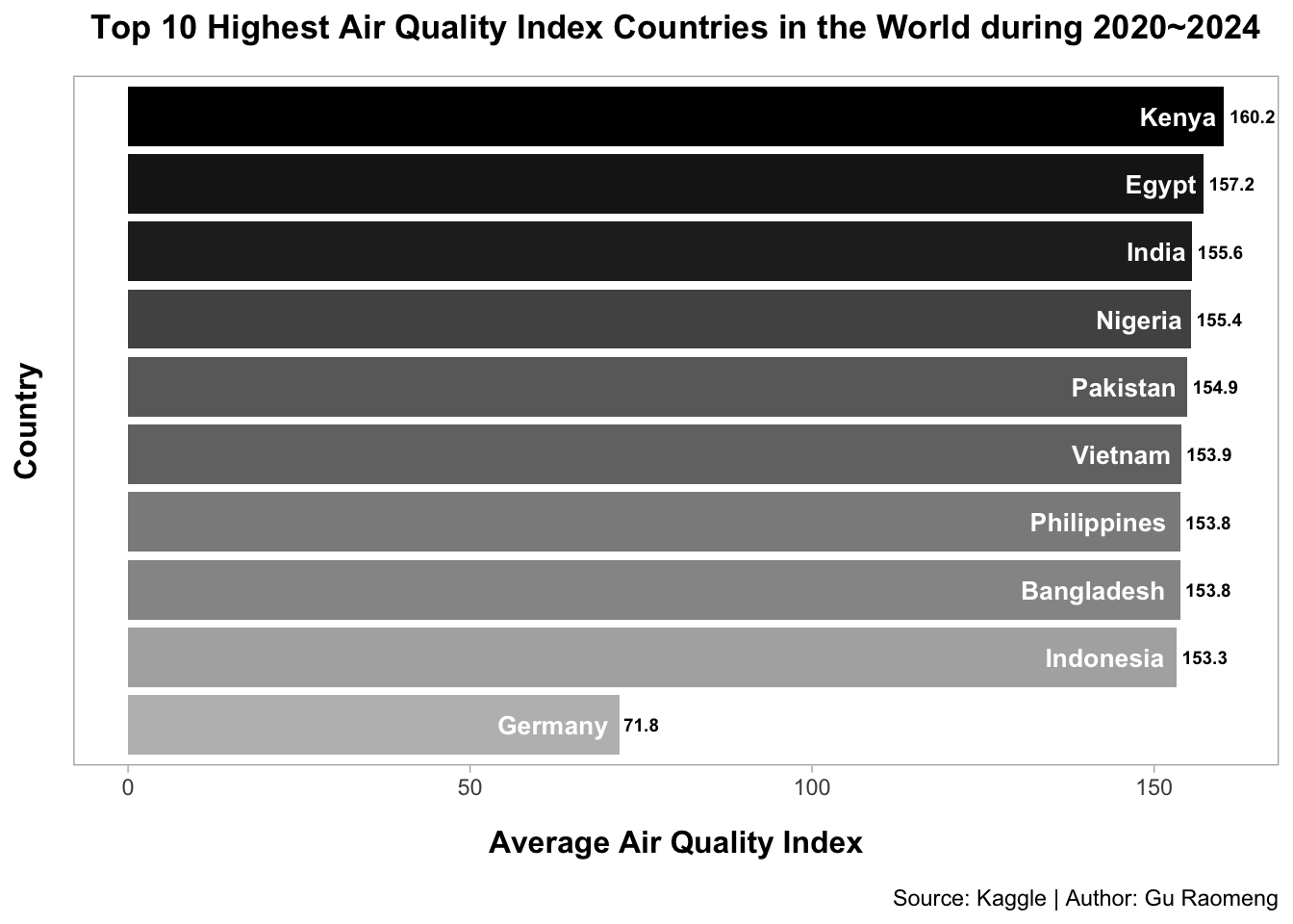
# Step2: Draw the bar chart about top 10 highest AQI countries
p1 <- df1|>
  head(10) |>
  arrange(-avg_air_quality) |>
  mutate(country = factor(country, levels = country)) |>
  ggplot(aes(x = country,
            y = avg_air_quality,
             fill = country)) +
  geom_col(width = 0.88) +
  geom_text(aes(label = round(avg_air_quality, 1)),
            hjust = -0.12,
            size = 2.5,
            color = "black",
            fontface = "bold") +
  geom_text(aes(label = country),
            hjust = 1.1,
            size = 3.5,
            color = "white",
            fontface = "bold") +
  coord_flip() +
  scale_x_discrete(limits = rev) +
  labs(x= "Country",
       y = "Average Air Quality Index",
       title = "Top 10 Highest Air Quality Index Countries in the World during 2020~2024",
       caption = "Source: Kaggle | Author: Gu Raomeng") +
  scale_fill_manual(values = rev(c("#bdbdbd", "#b0b0b0", "#969696", "#8c8c8c", "#737373", "#6a6a6a", "#525252", "#252525", "#1a1a1a", "#000000"))) +
  theme_light() +
  theme(panel.grid = element_blank(),
        axis.text.y = element_blank(),
        axis.ticks.y = element_blank(),
        legend.position = "none",
        plot.title = element_text(face = "bold",
                                  size = 13,
                                  hjust = 0.5,
                                  margin = margin(b = 12)),
        axis.title.x = element_text(face = "bold",
                                    size = 12,
                                    color = "#000000",
                                    margin = margin(t = 12)),
        axis.title.y = element_text(face = "bold",
                                    size = 12,
                                    color = "#000000",
                                    margin = margin(r = 12)),
        plot.caption = element_text(margin = margin(t = 12)))
print(p1)